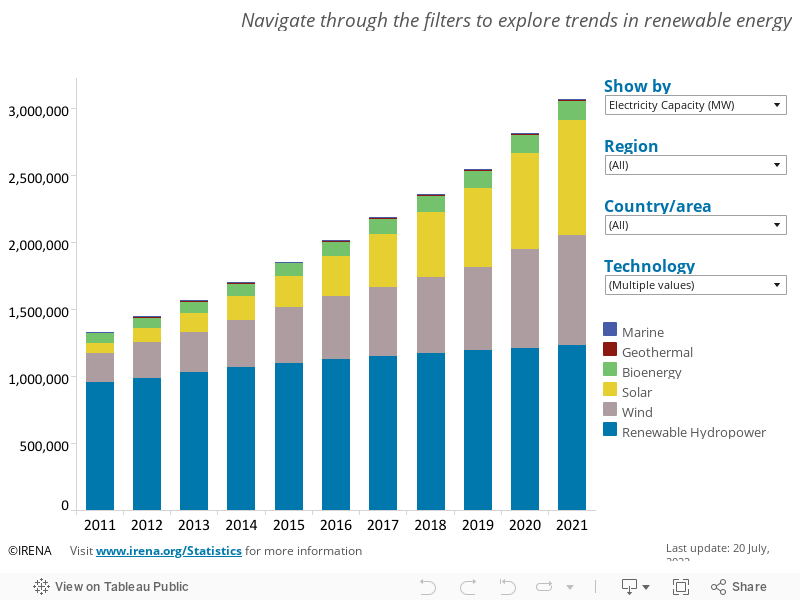
2. Repeat step 1, but now select the North American region and the United States, what do you notice that's different?
3. Select only Marine as technology and flip through the regions. Which region generates the most capacitance for Marine technology in 2016?
4. Which region generated the most Bioenergy in 2014? to find this you'll need to click the "Show by" drop down arrow and select "Electricity Generation".
5. Do you think the amount of electricity generated will increase, decrease, or stay the same in years after 2016 and why?


This comment has been removed by the author.
ReplyDeleteThis comment has been removed by the author.
ReplyDelete1: It's kind of difficult because there are no y-axis labels for "marine" and I can't tell which one it is when they're all displayed-- but my best guess would be "wind" at about 250k
ReplyDelete2: Both still wind- unless you're asking for percentage increase? It looks as though US is falling way behind the other countries in North America in hydropower-- maybe our pipelines and water crises are contributing to that.
3: Looks like Oceania but again, there is no y-axis labels
4: This is kind of misleading-- the stats for Europe in 2010 is 478 GWh and for South America it's .001 but they have the same size bar, so because of the no y-axis I would have to go to each one for each year and hover and write them down to compare.
5. again, the visualization not only doesn't help me answer this question, it kind of impedes my ability to do so-- it would be easier with the spreadsheet.
6. I think the amount of energy produced will increase but only slightly. It seems to have plateaued.
Thanks for this visualization and the thoughtful questions!
--Rachel Gordon
1. It looks like solar has had the largest increase,both in magnitude and in proportion.
ReplyDelete2. Just looking at North America, it looks like wind has the largest increase in magnitude, but solar still has the largest proportional increase.
3. Asia generated the most marine energy in 2016.
4. Europe generated the most Bioenergy in 2014.
5. I imagine that the amount of energy generated will increase in the years after 2016. All types of energy (or at least the major ones) have increased from one year to the next on the graph, and I see no reason why that would change. Though the US may have less renewable energy from 2016-2020, I know that China has been pretty good about generating more renewable energy, which is huge considering how much energy China consumes.